Showing posts with label portrait. Show all posts

Friday, July 29, 2016

Digital portrait study and speed up video

 Here is may realistic digital study portrait, drew with Manga Studio 5x. I wanted to keep it within a one hour frame, but still went 5 minutes over. This was a great exercise to do and it was fun to learn a bit about how the program works and what I can do with it.


For reference, I used Rembrandt's Portrait of Haesje van Cleyburgh. There are many issues glaring back at me in terms of resemblance, but I am happy with what I have accomplished with the program so far.


Here is the speed up video, enjoy!!


Wednesday, February 24, 2016

Markers and more markers!!

The 29 faces challenge is almost over and I am still trying to catch up. This is a goal I set for myself, so I am really trying to finish all 29 faces, even if it is after the challenge ends. As with all of the other faces, I have been experimenting and practicing with a variety of media.

Face #14 is another alcohol marker (Copic markers) on Copic marker paper, this time, as you can see, with inked lines.


I have always admire those beautiful line and marker illustrations, so I decided to stop postponing it for a later time and start practicing. I am way far from where I want to be, however I am feeling more inspire to continue practicing and see how much I can improve. 

Face#15, the same approach as with face #4.


Here I tried to get a better blending. I really like how the face came out. It is fun and challenging at the same time, such an unforgiving but also liberating media. 

Sunday, February 21, 2016

Finally, 13 is here!!!

Here is face #13 "Bold" for the 29 faces challenge.


 She went through many changes for the last 3 days ( 1 hour each day), and I wish I would have been able to make her eyelashes better, and that my glitter paint were in a better condition, even though I just opened it for this project. Another thing to my liking is that some of the paper shows and compliment the piece very nicely. 

In a way this is a good study for painting drapery, something I really need to practice. 

Wednesday, February 17, 2016

More and more faces and grounds to play with!!!!


Here trying to catch up. I stayed behind a bit again, because the grounds I am trying out needed 24 hours to dry before using them.

Face #10

This cute "Fae Princess" is a mixed media piece. I used Caran D'Ache gouache studio set, colored pencils, Sharpie paint marker and a bit of acrylic over a paper treated with Daniel Smith transparent watercolor ground. Here I used the gouache very diluted, making it transparent like watercolors.


I still don't know how I feel about this ground. I didn't find it to be too absorbent, although I did not use a very thick layer on the paper. I put two coats of this ground on the papers. It is indeed better than untreated paper; maybe some more experimentation, on other surfaces, is in order to give a final verdict about this. It does dry clear, which give you the advantage of using the substrate color to your advantage. It does comes with a white finish though. 


Face #11, "Forest Fae" was also created on paper treated with Daniel Smith transparent watercolor ground  but with this one I only used gouache. I really like her too, she looks innocent and sweet to me; maybe is that huge bright eye.

 Here I took advantage of the green of the paper, as it also inspired the color scheme. So the fact that the watercolor ground was transparent helped me here.


For face #12


The surface Martha Stewart stucco ground was used. I really enjoy working on textured surface. I feel it give a certain character and interest to the pieces. This ground too need 24 hrs to dry before using it.
I wish I would have applied it more uneven, an also used less concentrated acrylic so it has more dimension. Even though, I like the old weathered look it has. I will continue exploring this idea in other pieces.

Sunday, February 7, 2016

"Prayer": face 6 of 29 faces challenge

Here is my face #6, titled "Prayer". I prepared the paper with two thin coats of clear gesso. I was going to do it in color but then decided to go for a grey monochromatic color scheme. I think I worked great because the hearts from the paper stand out a bit and direct the eye to her. Plus the blueish undertone of the paint symbolized the "feeling blue" sentiment. When I feel blue I pray and then I am back to color.


Hands are always a challenge for me, and at first I wasn't sure to add it or not, but it was asking for it. It didn't feel finish nor did it conveyed the emotion and story I wanted. So I decided to add it. Not the best hand, but it does help to make the picture complete.

Thursday, February 4, 2016

Face #4 29 faces challenge

Today was a busy day but things got accomplished. Falling asleep every now and then I mange to draw my fourth face. I lost the gesture I was looking for and since my challenge today was to sketch with markers first, I couldn't erase. I din't want to give up on her, so I just pushed it and ended up learning a few things.

I used alcohol markers, colored pencils and gel pens on Copic paper. I glued it in my journal.

Trying out some grounds

Hello there!! Hope you are trying out and experimenting with new things. Today I had some fun experimenting with fiber paste as a ground in order to prepare my page for my third face from the 29 Faces challenge.

This medium give the surface you apply it to nice texture, one similar to handmade papers. You can sand it a bit if you want, I did it bit, but then some of the nice texture was lost.

I think it is a medium worth playing with and trying it with different materials. For example, I used Prismacolor colored pencils, but I think it would be nice to pastels, charcoal, pencil and even paint. Anyway, here is my third face from the challenge. I decided to add more fiber paste over it to give it a different look.


As you can see, fiber paste doesn't have to be use just as a ground.


Tuesday, February 2, 2016

Patterned paper as inspiration

My new schetchbook/art journal for the 29 Faces 2016 challenge have prove to be a great idea. The patterned paper have been a source of inspiration at different stages of the drawing/painting process. Although this is only the second face, my sketchbook have provided me direction, inspiration and freedom.

Since I first saw the paper used for this face, I knew I wanted to draw a male. Because the paper is tick and textured, and was already stretched/glued to the chipboard page, I decided to dive right in with acrylic paint without preparing it with gesso. I did a light sketch of the face first, then I decided to use a limited number of colors as part of a challenge and experimenting process. The colors were, scarlet red, yellow ochre, ultramarine blue and unbleached titanium white. From there I mixed all my colors, adjusting with the unbleached titanium white.

In the middle of the process I realized that the paper was looking like the sea and no more like blue painted wood. That motivated me even more and filled me with excitement about this page. I only added a little blue around him to make it a bit darker and make him part of the page a little bit more naturally. 

Once again, I have tones of fun experimenting here. The paper hold up beautifully and I starting to feel motivated, inspired and fearless about experimenting again. 

What are you doing to keep yourself motivated and inspired? Are you been fearless in your art or craft?


Thursday, June 7, 2012

Playing on my altered book/journal with art supplies

This are the latest art journaling pages I've done on my altered book. Here I have tried different mediums, without fear. I got the book at my local Goodwill for a $1 and started playing with it. The motivation to start an altered book/journal came from Jane Davenport's class, Supplies me. A wonderful class, where she shows how to use lots of art supplies. I got fearful and started trying all the supplies I have been piling and not using.

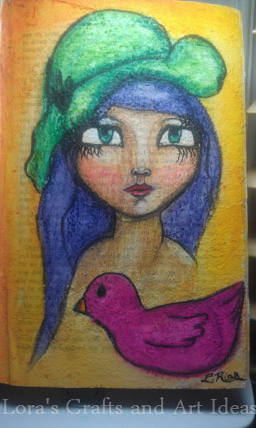
This girls was made over fiber paste with water-soluble oil pastels (Portfolio, from Crayola). I sketched her with india ink; trying not to worrying about mistakes, just letting my self loose and seeing what could happen. She is not perfect, and if I would have sketched her with pencil, I might have made a few changes for sure. However, my goal was to let it loose and have fun, instead of seeking perfection. I didn't have to apply much pigment since the surface was very textured. The pastels were blended  with a water brush, they reacted beautifully. The only thing I found out is that I should have used some fixative, because after a couple of days, the pink on her cheek moved to another areas; also the colors started transferring to the opposite page. It has never happened to me before, so I guess it is do to the textured surface.


The next girl, was made over absorbent ground. It is used over gessoed surfaces to prepared the surface for watercolors and acrylics as well. It is very absorbent, and for me, the watercolors did not behave as on normal watercolor paper. I tried wetting the surface but it dried quite fast, so I feel that basically it was more of a wet on dry technique. For this one, I used TCW stencil (mini time travel), distress stains, india ink, acrylics, homemade glitter mists and watercolors. On this page I was practicing drawing arms, for the supplies me lesson. I really like this one, she is looking at the horizon waiting, for what? who knows. But it look serene and calm.


I really enjoyed the process of making these pages, they helped me with the art block I have lately. Welcome back my art muse!!!

Thursday, May 31, 2012

Holly Mary Journal Page

by: L. Rios all copyright reserved 2012
A page from my Moleskine portrait journal, I loved and thoroughly enjoyed the process for this one. It took me more than one day but I don't regret it. This is the first time I used light modeling paste on any of my journals; I put it around the head and borders of the other page, to give texture and dimension. The modeling paste take some time to dry, so I just left it overnight to make sure it was dry before applying the blue paint. Also, added extra modeling paste after applying the acrylic paint and while it was wet. I did that, in order to create different tonalities. The face was made with Prismacolor pencils over a coat of clear gesso. Acrylic paint and ink were used on the rest of the pages; three-dimensional stickers complete the image. Writing on the right is a prayer to Jesus' mother, Mary.

The soft look of her eyes and the young and pure look of her face made me think of Virgin Mary, so I wrote down a beautiful prayer on the other page. This is one of my favorites pages; it is calming to look at her eyes, plus I can't stop touching all the textures on this pages.

Playing with alcohol markers

"Lola" by L. Rios all copyrights reserved

Finally, I decided to be brave and try out alcohol markers. All thanks to Jane Davenport's class Supplies Me, it is a lovely class where she shows how to use almost every art supply out there. Since I new that we were going to learn how to use alcohol markers, I went crazy and bought a few (not really, I bought lots). My collection of markers is mainly composed of Promarkers, followed by the new kid in the block, the Spectrum Noir (very affordable); and last but not least a few (very few) Copics.

For the Copics, due to the fact that they are so expensive, I just bought a couple of skin tones. The Promarkers I have in a wide range of colors and also in skin tones. I also got the Spectrum Noirs in skin tones, but also earthy tones, cool and warm grey tone. So, yes I did expend a lot in a spam of 5 months, trying to get a sample of every alcohol marker I could. For the sake of clarifying, the Supplies Me class does not required you to have all the alcohol markers that are out there; it was my own decision to get at least a sample of most of them.

Alcohol markers are very blend-able, and all the brands mentioned above works together very well. As you can see on the portrait I made and called "Lola", they blend pretty good. Please, keep in mind this is the first time I play with them for real, so it is not flawless but not too bad either. It wasn't totally easy, and it took some time to get the feeling of it and start learning how the markers behave on the paper, and how they interact with each other. Coloring with alcohol markers, requires patience and time if you want to get decent results at the beginning of this journey. I realize how different the coloring technique is, in comparison to colored pencils (like Prismacolors). The building up of the shadows is quite different that what I am use to with the Prismacolors. Lola's face, arms and hair were colored with alcohol markers; while the background and dress were colored with watercolors and distress stain, respectively on Canson Fanboy paper. This shows, how alcohol markers are also a great addition to your mixed media supplies.

The process for making "Lola" was fun and instructive; and I will definitely keep practicing coloring with alcohol markers and use them more often on my mixed media journaling. Will you give it a try?


Sunday, March 11, 2012

Oil portrait: "Eclectic"

I really like this one, I was not aiming for a realistic portrait but for one that looked kind of "cartoony". It has lots of elements that I like, for example: colors, the greek column, egyptian looking eyes and jewelery. This was fun to do and I love how it looks.


"Eclectic"